MFT Card Design Superstar Submission v.2

This design came to me as I was browsing my MFT dies to see what I might use. I came across the Sentiment strips and thought they would look awesome as a background design. You know what? They totally do!

My original thought was to cut a window out of the upper middle and have the strips on the front of the card and a sentiment on the inside showing through the window, but I quickly realized that wasn’t going to translate itself as well in reality as it did in my head. So that design got nixed. The Accent It Die-namics turned out to be perfect because they provide that sentiment without detracting from the interest of the strips.

What I love most about this design is it’s versatility. Change up the color of the glitter paper, and you’ve got a card for an entirely different event. Use black glitter paper and you’ve got a graduation card; use silver and you’ve got a wedding card; use gold and you’ve got a wedding or New Years card; pink or blue…hey, there, baby; need a birthday card? Pick a color. 😉

I will admit, assembling all the sentiment strips is a bit time consuming, but it has a fabulous impact, especially in person! I didn’t stamp anything on the inside because I wanted to keep this available for any event (gold seems to be trendy that way), but I did layer a full-mat of mint paper on the inside for an added level of interest and a fun little surprise.

Signature Splatter

Quotes Engravers MTSUPPLIES:
Dies: Accent It: Celebrate, Sentiment Strips (My Favorite Things)
Cardstock: Stamper’s Select White (Papertrey Ink), Mint To Be (Avery Elle), Glitter (DCWV)
Accents: Black Rhinestones, Gold Stars Sequins (Pretty Pink Posh)

MFT Card Design Superstar Submission

I first heard about this contest through my friend, Janet, who encouraged me (repeatedly!) to enter. She was even kind enough to loan me some of her MFT stamps, one of which was a cute little mummy-child.

When I was younger, my family and I took a trip to Egypt. We got to spend a week visiting the pyramids, seeing tombs, and viewing the rich history of the culture. It remains one of the most memorable experiences of my life.

Mummies, therefore, always remind me of my trip to Egypt…even cute little Halloween children images of mummies. So my first thought was to use this little guy for a card for my mom. Cute as he is though, I didn’t want him on the front of my non-Halloween card. I’m just a traditional nut job like that.

Enter, gauze. Being fresh out of cheesecloth, I raided the first aide supplies. I have every intention of restocking later…hopefully before the next disaster rather than after. A word to the wise: if you’re going to try this at home, don’t use multi medium matte to seal over the top of the gauze. Or maybe do, if that’s what you want. But take it from someone who tried that: it may give the gauze a great “permanent” texture, but it won’t be as soft or – dare I say it – feminine as leaving the top side be.

I wanted a lot of texture so I stretched the gauze along the long side and pulled the narrow sides apart a bit, roughing the weaving up in areas with my fingers. I also added a lot of ripples and bubbled areas to the gauze as I was gluing it down to give it even more texture and dimension.

For the glue, I spread a pretty decent layer of Multi Medium Matte over the card mat (I did not apply the gauze directly to my card base as I figured it would need some additional support). If your layer of glue is too thin, it won’t end up holding the gauze to the cardstock once it dries. Speaking of drying… work in sections or your glue might be dry before you finish…

For the labels, I smeared the edges through Versamark and applied gold embossing power. I wanted the front to be reminiscent of our trip to Egypt, so I found a hieroglyph-like font and typed up a few of the dingbat images to create a sentiment strip. [Funny side note; we actually have a printer that uses wax instead of ink to print. Little did I realize, when I went to heat the embossing power along the edges, the wax melted a bit which gave it the appearance of a stamped design rater than the strong, crisp black of the printer. I like how it ended up looking; it seems older this way.]

You were beginning to wonder where the cute little mummy-child was, weren’t you? Well, here he is, carrying a translated plaque of the hieroglyph sentiment. I brought in a dark full-mat color for the inside because I liked the unexpectedness of it after all the gold and it also served to tie in the darker color of the sentiment on the front. I colored the mummy-child with some Copics because leaving him white seemed too stark for the dark background and also gave him an aged look. I think I need to work on rosying cheeks, though…

Thanks for looking!

P.S. Please forgive the photos. I was in a rush to get them done…

Signature Splatter

Quotes Engravers MTSUPPLIES:
Stamps: Pure Innocence Mummy (My Favorite Things)
Dies: Designer Label Stax #3, Pure Innocence Mummy (My Favorite Things)
Cardstock: Stamper’s Select White, Smokey Shadow (Papertrey Ink)
Ink: Versamark, Memento Tuxedo Black (Tsukineko)
Copics: E00, R20, T1, T3
Accents: Heidi Swapp Color Shine in Gold Lame (American Crafts), Perfect Pearls Mist in Gold (Ranger), Gold Embossing Power (Hampton Art), Metallic Thread (Gutermann), Black Rhinestones
Other: Multi Medium Matte (Ranger), Rolled Gauze, Egyptian Silhouettes Font, Gyptienne Font

Too Bad, So Sad.

Well, work decided to intrude on my grand plans to participate in this weekend’s Stamp-A-Faire over at Papertrey Ink. Typical, right? Not much I can create when working double shifts two days in a row. I guess I’m just going to have to live vicariously through all the other participants this year and comment on cards as much as I can. If I’m not a born-again Zombie by Monday morning, maybe I’ll try to put some glue to paper and at least get some things created, if not posted. Have fun all!!

I Finally Did It! v.2

For my second card for Papertrey Ink‘s July Blog Hop, I stuck with the same ‘cherries in aqua bowl’ color scheme, but this time omitting scarlet jewel from the palette.

I wanted to try a variation using the same overlapping triangular focal point as my first card, so I stamped a background using numerous birthday message stamps from a couple different sets. To keep from concealing all my time and effort stamping all that (*phew!*), I reduced the size of the triangles (as well as the number by giving scarlet jewel the axe). Had I considered it better before hand, I would have either stamped some kind of scroll-like filler under the ‘birthday’ script or heat embossed the ‘birthday’ sentiment because I’m not completely happy with the gap of space there. The background is almost too overwhelming for the message. But since I didn’t really notice the gap before I adhered all the triangles onto the card front with foam dots, I couldn’t (comfortably and without anxiety) stamp below the birthday after that. But in my mind, I’m thinking it would look better that way. Or at least embossed.

Signature Splatter

Quotes Engravers MTSUPPLIES:
Stamps: Stylish Sentiments: Birthday, Big Birthday Wishes (Papertrey Ink)
Cardstock: Stamper’s Select White, Pure Poppy, Summer Sunrise, New Leaf, Aqua Mist (Papertrey Ink)
Ink: Smokey Shadow, Pure Poppy, Summer Sunrise, New Leaf, Aqua Mist (Papertrey Ink)

Tagged , ,

I Finally Did It!

I keep finding myself wanting to participate in so many of the card challenges around the blog sphere, but lacking the time, drive, or available crafting space to get anything done. But no more! (er…at least, not for this challenge). I finally found the – in this case – space to craft a couple cards. *tear* I’m so proud. 😉

This month’s Blog Hop challenge over at Papertrey Ink was to choose one of the given ‘fruits of summer’ color schemes. I opted to use ‘cherries in aqua bowl’:

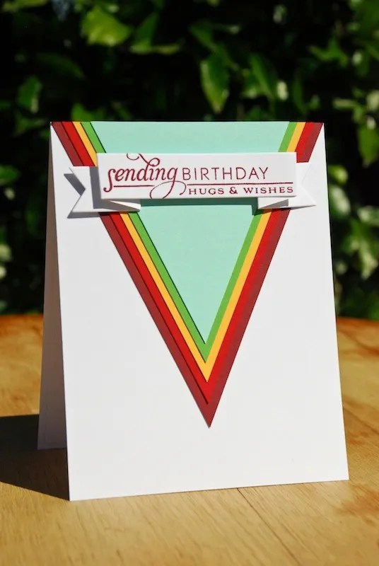
I’m not usually one for such bold, geometric designs, but I love how striking it is! I had started on it with the decision that I would do something less girly (that’s what I usually seem to end up gravitating towards). By making a new layer for each of the colors, the stacked papers give it quite a bit of depth and dimension as well as a strong focal point. Creating those triangles was the biggest challenge. I don’t have a die that comes anywhere close to the size or shape I wanted (large pennant, here I come), so I had to measure and cut them by hand. I started with the scarlet jewel layer and figured out the size and shape from there since it would be my largest filler on the card front. To save myself some sanity for times of real crisis, I then wound up just tracing all the other colors to the same size/shape and cutting off the top overhang after I glued each one down. The banner really brought it all together after that.

I wanted to bring the some of the colors from the outside to the inside, so I selectively inked one of the longer stamps from Stylish Sentiments: Birthday in the top tier of colors.

Signature Splatter

Quotes Engravers MTSUPPLIES:
Stamps: Stylish Sentiments: Birthday (Papertrey Ink)
Cardstock: Stamper’s Select White, Scarlet Jewel, Pure Poppy, Summer Sunrise, New Leaf, Aqua Mist (Papertrey Ink)
Ink: Scarlet Jewel, Aqua Mist, New Leaf, Summer Sunrise (Papertrey Ink)
Dies: Sayings With Banner (Simon Says Stamp)

Tagged , ,

Stamp-A-Faire 2012: DIYer

I’m on the fast track to becoming a regular homemade embellisher! In addition to creating some homemade washi tape that has yet to find a project-home, and creating a doily rosette medallion, Jessica Witty made a tutorial using Clearly Creative Cardstock to make a stamped transparent overlay for a card front. Well, the nano-second I saw that, I was all over it like white on rice. Only with much more enthusiasm.

I had recently gotten a package of this very elusive cardstock when I noticed it had finally come back into stock after a very lengthy delay in which my nails became nubs from tap-tap-tapping them in anxious impatience during the wait. I love the look of clear transparent overlays, and had some transparency sheets (you know, those kind teachers use for the overhead projector in school?), but they just didn’t work so well for stamping…or die cutting…or regular cutting…or, well, any type of crafting endeavor I could wrap my little brain around. So I was uber excited when I finally got my greedy little paws on the diamond mine. But as is my way, I put it “away” in its new home where it would be safe and then never got around to pulling it back out and using it. Ppsh. Yeah, I know.

So what happened next, you ask? Well, another designer had me in mind when she made her DIY homemade embellishment tutorial. It’s so nice to be thought of. 😉

I LOVE how this card turned out!! The colors didn’t come out right at all, mind you. The satin ribbon should be closer to Hawaiian Shores, not Ocean Tides, but you get the idea. I love how bright and sunny and positively FUN it is! It really came together perfectly considering I didn’t have much of a plan in mind when I started out. I wanted to add a little touch of something into the inside of the card since the outside is so happy, so I stamped a sun and some rays around the inside. It’s meant to be written over with your message, so I kept it light and simple.

Signature Splatter

Quotes Engravers MTSUPPLIES:
Stamps: Hello Sunshine (Papertrey Ink)
Paper: Clearly Creative Cardstock, Stamper’s Select White (Papertrey Ink); Bright Prints (Recollections)
Ink: Jet Black (Staz On); Lemon Tart, Harvest Gold (Papertrey Ink)
Accents: Celebrate It Basic-Basic satin ribbon (Michaels); Mini Library Clips (Stampin’ Up)

Tagged ,

Stamp-A-Faire 2012: DIY

There were so many fantastic ideas for the homemade embellishments tutorials challenge that I couldn’t pick just one – it was another ribbon moment, relived. I created some homemade washi tape using the tutorial Danielle Flanders made, but I haven’t yet put them on a card. They are currently in a time out under a heavy stack trying to straighten out their behavior. 😉 More on them later.

I happen to swoon for rosettes. Total foot-popping, heart soaring, swoon. As it happens, Betsy Veldman must have had me in mind because she created a tutorial on making a homemade rosette from a doily die. A doily die?!? Yes, you and I both heard right. A doily die. I’d never used one to make a rosette before either, but as it turns out, it makes it very pretty! And as it so happens, I’d recently gotten my hands on some utterly beautiful doily dies that I suppose I was destined to put to good use today.

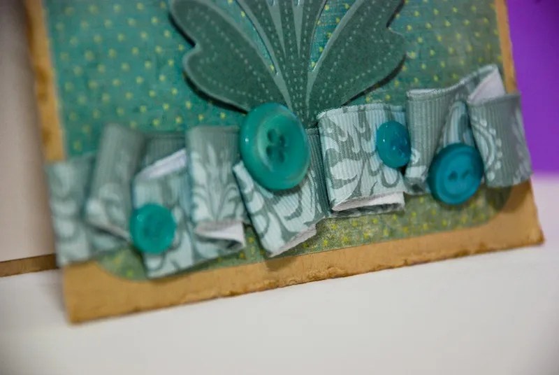
The die that I used had pretty wide spaced scalloping around the edge, so the rosette came out pretty fat – too fat for a card to my way of thinking. To remedy that issue, I took a 6×6 pattern paper pad, splayed my palm over it, and crushed that little rosette into submission. The result was a very pretty looking, much flatter and more appropriate for a card rosette. The colors weren’t what I envisioned when I started with that purple paper. I pictured bright and cheerful in my mind. It’s a little more muted this way and less my-comfort-zone, so I kept adding little touches until it looked/felt right.

Signature Splatter

Quotes Engravers MTSUPPLIES:
Stamps: Rosie Posie, Modern Wood Mats (Papertrey Ink)
Cardstock: Kraft, Vintage Cream (inside), Ocean Tides (Papertrey Ink)
Paper: Dot Pattern (K & Company); Pattern Pad (Studio G)
Ink: Ocean Tides, Vintage Cream, Classic Kraft (Papertrey Ink)
Dies: English Tea Party Doily (Cherry Lynn Designs)
Accents: Ocean Tides, Plum Pudding, Vintage Cream, & White buttons (Papertrey Ink); Botanica ribbon (Michaels); Natural Cotton Twine

Tagged ,

Stamp-A-Faire 2012: Correspondance

Another of the challenges was to create a set of cards for yourself or for a gift. I opted to make a set of thank you cards to give to my mom for helping me recently with a very heart shredding situation. But we won’t get in to that. I need to keep my tear ducts dry and my heart firmly entrenched in my chest.

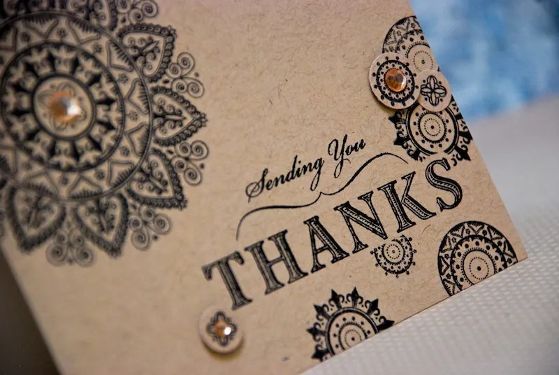
I wanted to make her a set of cards that was both elegant and universal, so I hit up my all-time favorite, go-to stamp set, Mehndi Medallions. I absolutely, positively, unconditionally adore that set. It has a infinite number of uses. It’s the Ranch Dressing of stamp sets. It goes with everything. 😉

I wanted to give it a subtle amount of dimension, so I added an assortment of rhinestones & pearls to each card and used some small circle punches to cut out a couple of the smaller medallion accents to pop them up with foam dots.

Signature Splatter

Quotes Engravers MTSUPPLIES:
Stamps: Mehndi Medallions, Sending A Big Thank You (Papertrey Ink)
Cardstock: Kraft, Vintage Cream (Papertrey Ink)
Ink: Jet Black (Staz On)
Accents: Rhinestones, Faux Pearls (Recollections)
Tools: 1/2″, 3/16″ Circle Punches (Stampin’ Up!)

Tagged ,

Stamp-A-Faire 2012: Craft Conservation

It’s a challenge upon a challenge for me to work with only a limited, set number of supplies. Why did I try to strong-arm this challenge, again? Oh, yeah, I was still preening from my success with the ribbon. The tail feathers blind sighted me. Being an eternal optimist (hi, that’s me), on the bright side, it turned out very nicely. It’s a lot prettier than I was expecting it to be when I was creating it. I think the colors really contributed to that. I wasn’t sure about them at first, but they came together in harmony at the end. Yeah to success!

See the bow? Yeah, that’s more preening. heh.

Signature Splatter

Quotes Engravers MTSUPPLIES:
Stamps: Pretty Peonies (Papertrey Ink)
Cardstock: Aqua Mist, Stamper’s Select White (Papertrey Ink)
Paper: Linen Vellum (Papertrey Ink)
Ink: Lavender Moon, Autumn Rose, Aqua Mist, Ocean Tides, Winter Wisteria, Smokey Shadow (Papertrey Ink); Versamark (Tsukineko)
Dies: Pretty Peonies (Papertrey Ink)
Accents: Spool O’ Ribbon (Offray)

Tagged ,

Stamp-A-Faire 2012: Knots Badge

The Knots Badge included tutorials encompassing ribbon techniques and tips. I was really looking forward to this lesson because I absolutely love me some ribbon! I find ribbon very flirty and girly and fun, so I’m all over that. The problems arise when I can’t stop staring at it long enough to figure out how to incorporate it into my project. I try. Diligently. I just fail. Repeatedly. But no more! Now, armed with these versatile and broad techniques, I can feel confident tackling the application of ribbon onto my cards!

Did I just sound like a cheesy commercial sales pitch? Because it sounded like I just sounded like a cheesy commercial sales pitch.  …

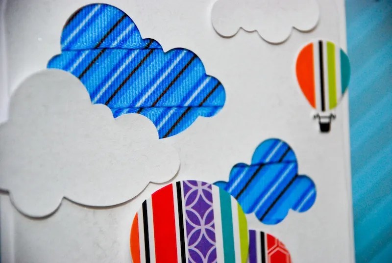
I was so impressed with all the wonderful ideas, that I tried more than one for this challenge. The first one I tackled was Erin Lincoln’s idea to back a negative die cut image with ribbon strips to create a colorful pattern in the die image. She made a beautiful pink ombre hued tiered cake in her card. I immediately thought how cute it would it be to do it using the clouds die.

It may be hard to see in the photos, but I gave the sky a beautiful pearled sheen with some Tattered Angel’s Glimmer Mist. When I first started assembling it, I wasn’t diggin’ the plain white and thought it needed just a little something, but not too much of something because I didn’t want to detract from the scene in the sky. I rarely find myself using Glimmer Mist (I only have two shades), but in this case, it gave the sky the absolutely perfect touch!

Quotes Engravers MTSUPPLIES:
Stamps: Up, Up, & Away (Papertrey Ink)
Cardstock: Stamper’s Select White (Papertrey Ink); Bermuda Bay (Stampin’ Up!)
Paper: Patterned Paper Pad (Studio G)
Ink: Jet Black (Staz On), Enchanted Evening (Papertrey Ink)
Dies: Up, Up, & Away, Clouds, Doubled Ended Banner (Papertrey Ink)
Accents: Dots & Stripes Ribbon (Michaels), Pearl Glimmer Mist (Tattered Angels)
Tools: Arrow Border Edger Punch (EK Success)

Divider Wayward Heart

The other technique I really wanted to try was Dawn McVey’s basic bow & basic knot. While this may sound simple, she ties some of the most gorgeous bows I’ve ever seen & getting it just right is a lot more challenging that it may seem. In fact, after giving it a try, I can safely say my hands & fingers are going to need a lot of practice!

Signature Splatter

Quotes Engravers MTSUPPLIES:
Stamps: Simply Jane (Papertrey Ink)
Cardstock: Kraft, Vintage Cream, Chipboard (Papertrey Ink)
Ink: Winter Wisteria, Smokey Shadow, Fine Linen (Papertrey Ink)
Dies: Simply Jane, Quatrefoil Plate (Papertrey Ink)
Accents: Plum Pudding buttons (Papertrey Ink); Celebrate It Basic-Basic satin ribbon (Michaels); Hematite Glitter Glue (Martha Stewart); Natural Cotton Twine

Tagged ,